Building HTML5 Components for Adobe Animate CC
Adobe Animate CC lets you create reusable UI components for HTML5 projects. Adobe's documentation is sparse. Most of what I learned came from reverse-engineering the built-in components.
Why custom components matter
Animate CC ships with basic components (buttons, video players, jQuery UI widgets), but real projects need custom controls. Components let designers drag reusable UI elements into projects without writing code.
Adobe doesn't explain how components work. The official docs describe using components, not building them. I dug into the source code of the built-in components.
Where Animate CC stores components
On Windows, Animate CC looks in two locations:
Built-in components (shipped with Animate):
C:\Program Files\Adobe\Adobe Animate CC 2017\Common\Configuration\HTML5Components
User-installed components:
C:\Users\<YourUserName>\AppData\Local\Adobe\Animate CC 2017\en_US\Configuration\HTML5Components
Put custom components in the user directory so Animate updates don't overwrite them.
Path conventions
Adobe uses UNIX-style forward slashes (/) in all component configs, even on Windows. Backslashes (\) break loading.
src/video.js           (works on all platforms)
src\video.js           (breaks on Mac, might break on Windows)
How Animate CC finds components
The default components directory:
C:\...\HTML5Components\
├── jqueryui/
│   ├── assets/
│   ├── locale/
│   └── src/
├── lib/
├── META-INF/
├── sdk/
├── ui/
│   ├── assets/
│   ├── locale/
│   └── src/
└── video/
    ├── assets/
    ├── locale/
    └── src/
Three of these (jqueryui, ui, video) appear in the Components Panel:
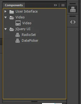
The others (lib, META-INF, sdk) don't show up—they're shared libraries.
A directory becomes a component category when it contains a components.js file. That file tells Animate what components live in that category.
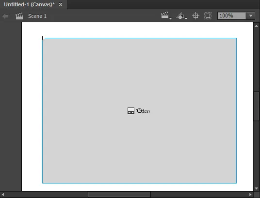
Reverse-engineering the Video component
The Video component is the simplest built-in component. Here's what it looks like on the canvas:
Its definition lives in .\HTML5Components\video\components.js. Despite the .js extension, it's JSON:
{
  "category": "CATEGORY_VIDEO",
  "components": [{
    "className": "an.Video",
    "displayName": "DISP_NAME_VIDEO",
    "version": "1.0",
    "source": "src/video.js",
    "icon": "assets/SP_FLVPlayback_Sm",
    "dimensions": [400, 300],
    "dependencies": [
      {"src": "../lib/jquery-2.2.4.min.js", "cdn": "https://code.jquery.com/jquery-2.2.4.min.js"},
      {"src": "../sdk/anwidget.js"}
    ],
    "properties": [
      {"name": "PROP_SOURCE", "variable": "src", "type": "Video Content Path", "default": ""},
      {"name": "PROP_AUTOPLAY", "variable": "autoplay", "type": "Boolean", "default": "true"},
      {"name": "PROP_CONTROLS", "variable": "controls", "type": "Boolean", "default": "true"},
      {"name": "PROP_MUTED", "variable": "muted", "type": "Boolean", "default": "false"},
      {"name": "PROP_LOOP", "variable": "loop", "type": "Boolean", "default": "true"},
      {"name": "PROP_POSTER", "variable": "poster", "type": "Image Path", "default": ""},
      {"name": "PROP_PRElOAD", "variable": "preload", "type": "Boolean", "default": "true"},
      {"name": "PROP_CLASS", "variable": "class", "type": "String", "default": "video"}
    ]
  }]
}
The components array can hold multiple component definitions—the jqueryui category defines dozens of components in one file.
You can edit this file and reload Animate CC's Components Panel (Window -> Components) to see changes immediately.
How properties work
The Video component defines 8 properties. These appear in the Property Panel in order:
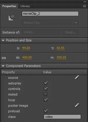
Property names use placeholder strings like PROP_SOURCE and PROP_AUTOPLAY. These get translated to human-readable labels via the locale file at .\HTML5Components\video\locale\strings.json:
{
  "locale": "en_US",
  "language": "en",
  "CATEGORY_VIDEO": "Video",
  "DISP_NAME_VIDEO": "Video",
  "PROP_SOURCE": "source",
  "PROP_AUTOPLAY": "autoplay",
  "PROP_CONTROLS": "controls",
  "PROP_MUTED": "muted",
  "PROP_LOOP": "loop",
  "PROP_POSTER": "poster image",
  "PROP_PRElOAD": "preload",
  "PROP_CLASS": "class"
}
Add translations by creating additional locale files (es_ES, fr_FR, etc.) with the same structure.
Property types
Animate CC supports several property types, each rendering differently in the Property Panel:
Video Content Path: File picker filtered for video files. The selected path is stored as a string.
Image Path: File picker for images. Animate copies selected images into your project's images directory automatically.
Boolean: Checkbox. The default value is a string ("true" or "false"), not a JavaScript boolean.
String: Text input field.
Collection: Dropdown menus or list selections (not used in the Video component, but available for complex components).
Breaking down a property definition
How the class property works:
{
  "name": "PROP_CLASS",
  "variable": "class",
  "type": "String",
  "default": "video"
}
name: References a placeholder in strings.json. PROP_CLASS maps to "class" in the English locale—the label in the Property Panel.
variable: The internal name for accessing this property in JavaScript. Access it as this._options['class'] in the component implementation (src/video.js).
type: Determines the UI control in the Property Panel. String renders a text input.
default: Initial value. The default CSS class "video" lets designers style video elements consistently.
This property lets designers add custom CSS classes to the video element for styling and JavaScript selection.
Building your own component
- Create a directory in the user HTML5Components folder
- Add a
components.jsfile defining metadata and properties - Create a
locale/strings.jsonwith property labels - Write the implementation in
src/ - Reload Animate CC's Components Panel
The Video component is the simplest reference. For more complex components, look at jQuery UI—they demonstrate event handling, dependencies, and dynamic property types.
What's next
The component behavior lives in the source file referenced by components[].source. For the Video component, that's .\HTML5Components\video\src\video.js. It contains the JavaScript that runs when the component is added to a project.
This work was part of the broader transition away from Flash. Chrome and other browsers were disabling Flash by default around this time, forcing designers and developers to find HTML5 alternatives. Nearly a decade later, Adobe would move Animate to maintenance mode—the Flash bridge to HTML5 couldn't hold.